The Body Shop | Packaging Redesign
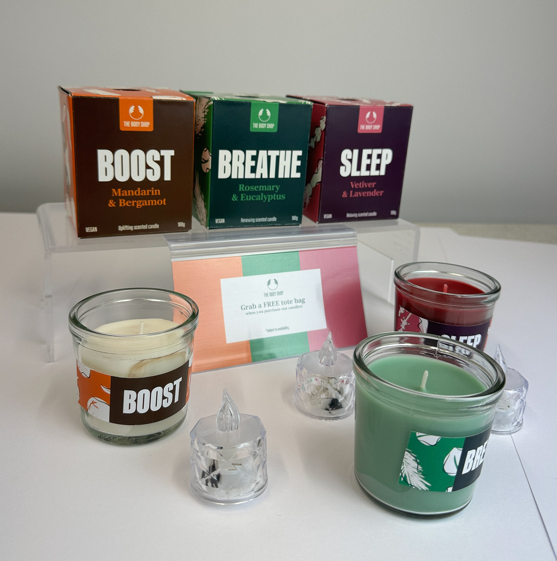
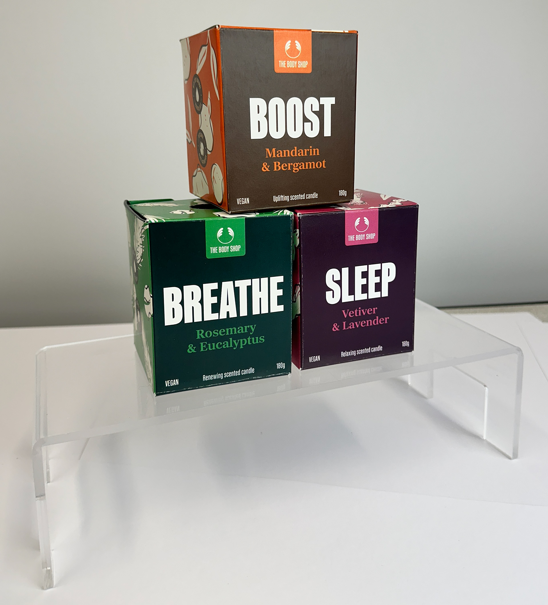
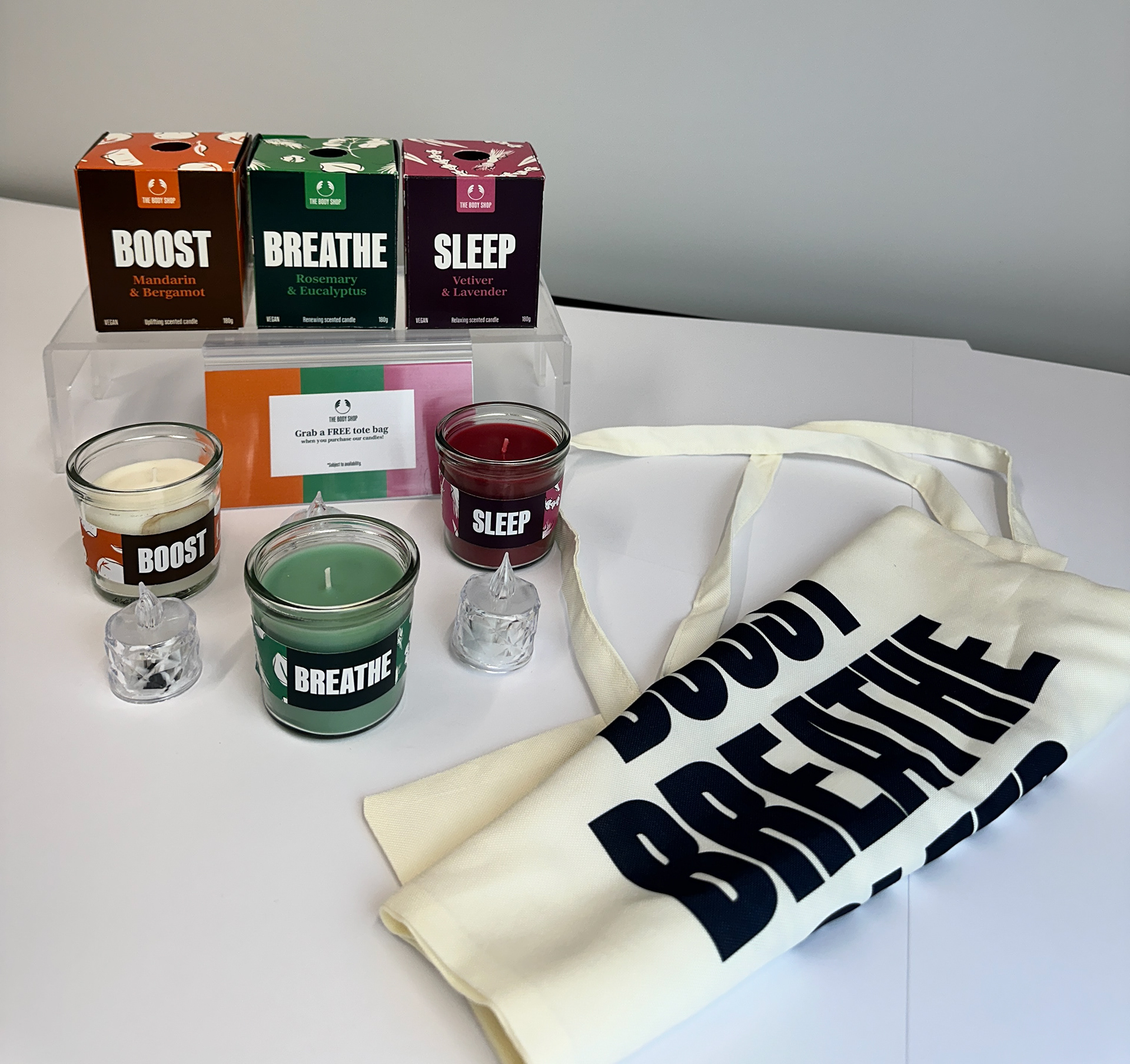
The existing range of candle packaging at The Body Shop currently diverges from the brand's broader visual identity, appearing less vibrant and engaging compared to other in-store items. The redesigned candle box packaging addresses this by adopting a more colourful and dynamic approach, aligning more closely with the brand’s core values: natural, bold, and sustainable.
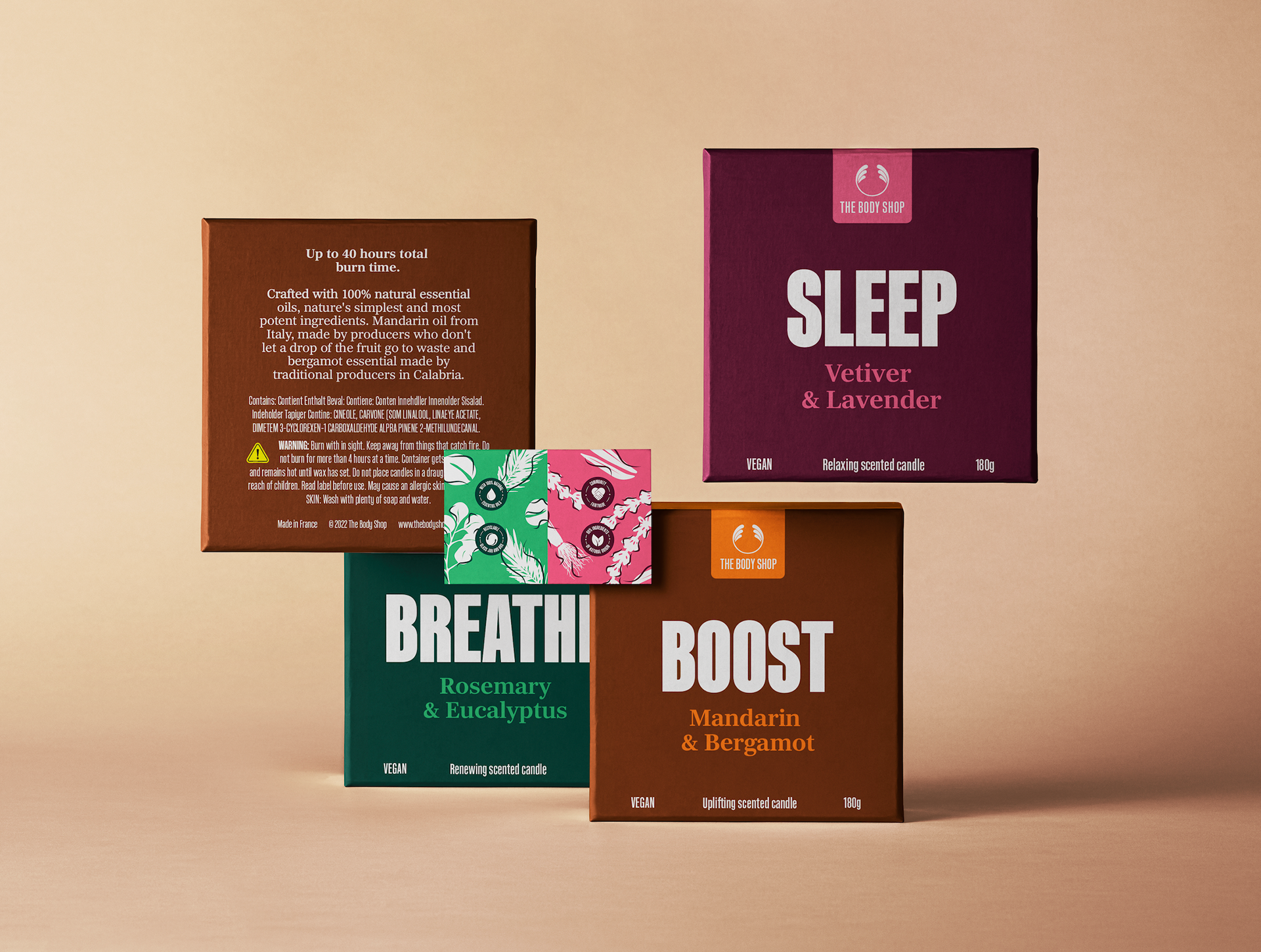
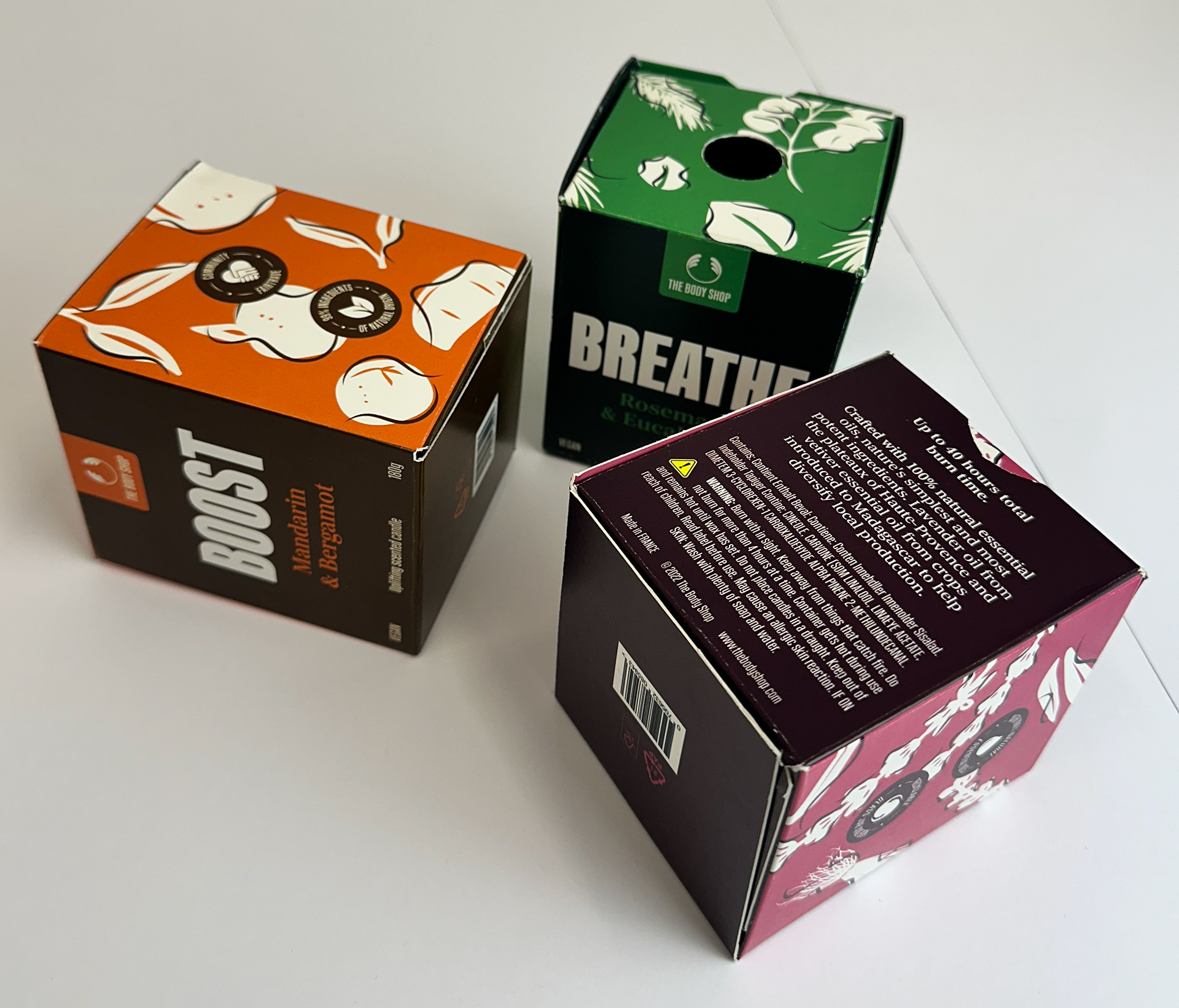
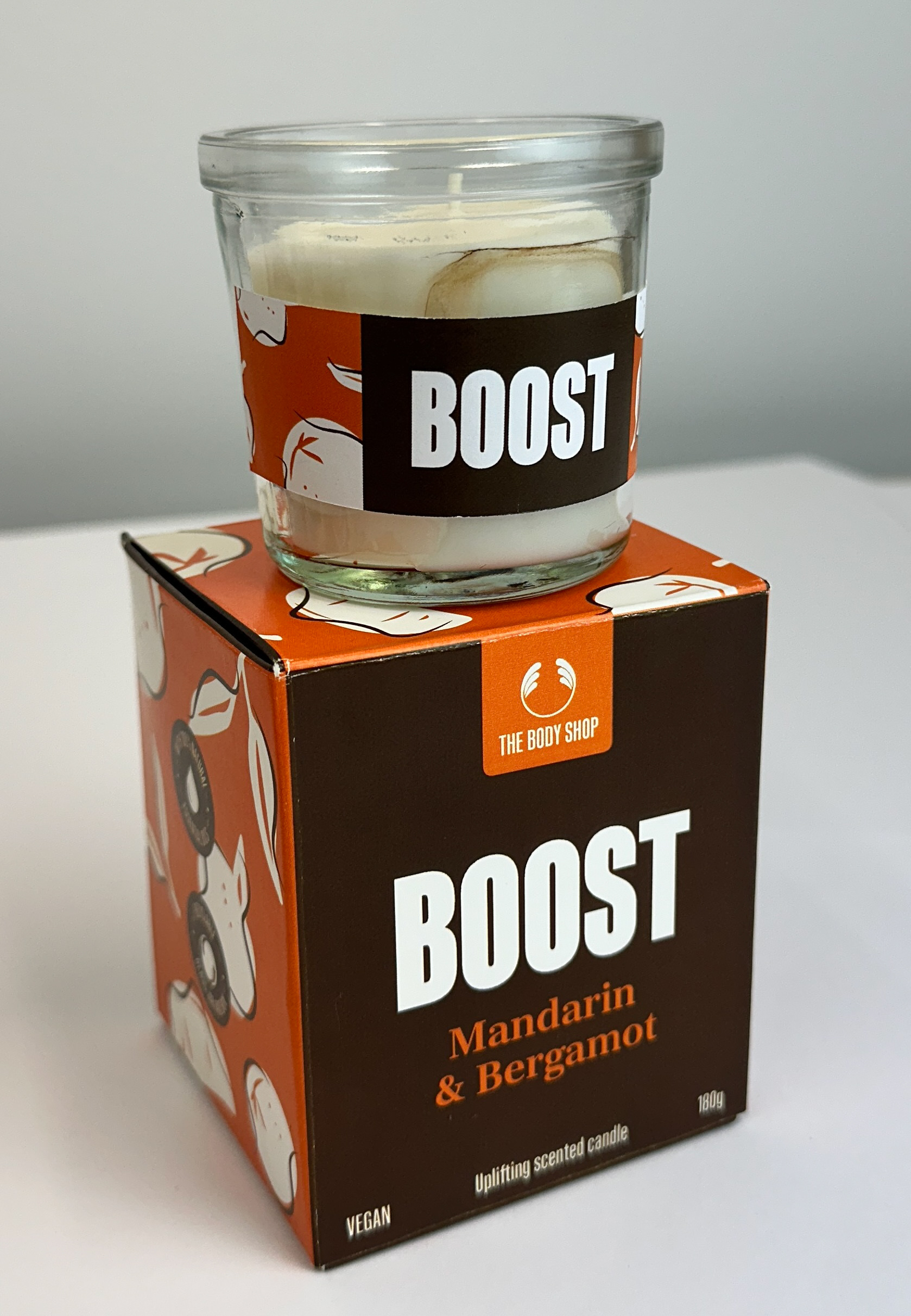
This new range features three distinct scents, each represented through thoughtfully crafted illustrations and curated colour palettes that highlight the natural ingredients used in the candle essences. The minimal detail within the illustrations reinforces the organic and honest nature of the product, while the bold use of colour and typography amplifies the packaging’s shelf impact. Although large-scale typography is typically a feature of in-store branding rather than packaging, incorporating it into the candle boxes establishes visual synergy and enhances brand recognition.
With The Body Shop currently undergoing administration, it is anticipated that these candles may be sold in third-party retail environments where the usual in-store product testing may not be available. To maintain the brand’s customer experience and commitment to transparency, a functional die-cut element has been introduced at the top of the box. This feature allows consumers to engage with the product by sampling the scent directly from the packaging, thereby preserving the brand’s ethos of accessibility and trust—even outside of its own retail spaces.