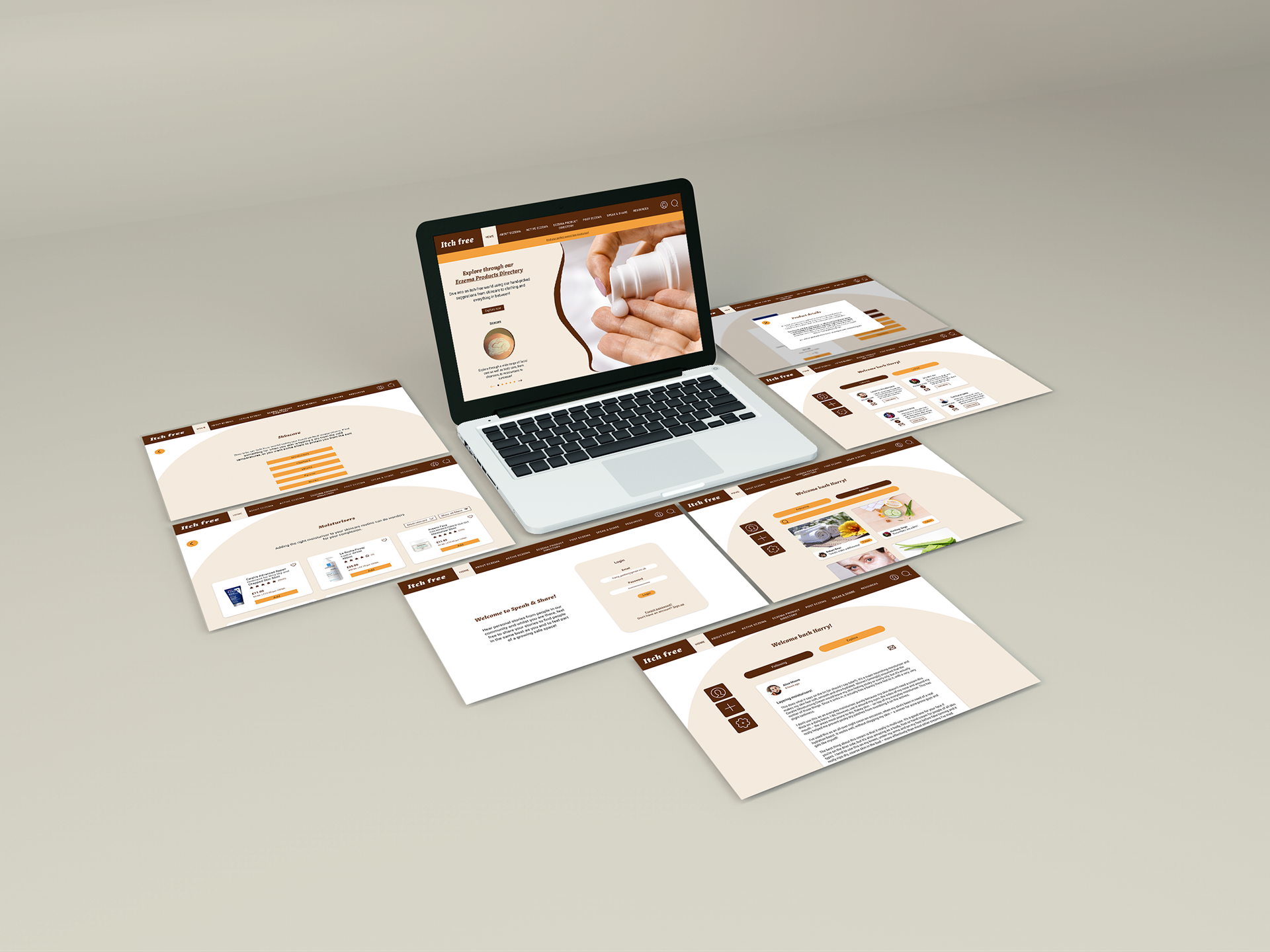
Itch free is a website/web app which targets users who suffer from Atopic Eczema, commonly known as Eczema. As the user enters the site, they are welcomed with a link to browse through a Eczema Product Directory page all catered for eczema patients which covers everything from skincare, to haircare to even what laundry detergent to use for clothing.
MODULE BRIEF
To carry out a robust user experience research process and then create a responsive web design on the subject of health, showing how the design would adapt to multiple devices and address the needs identified in your research. This project had a focus on process, understanding users, and problem solving.
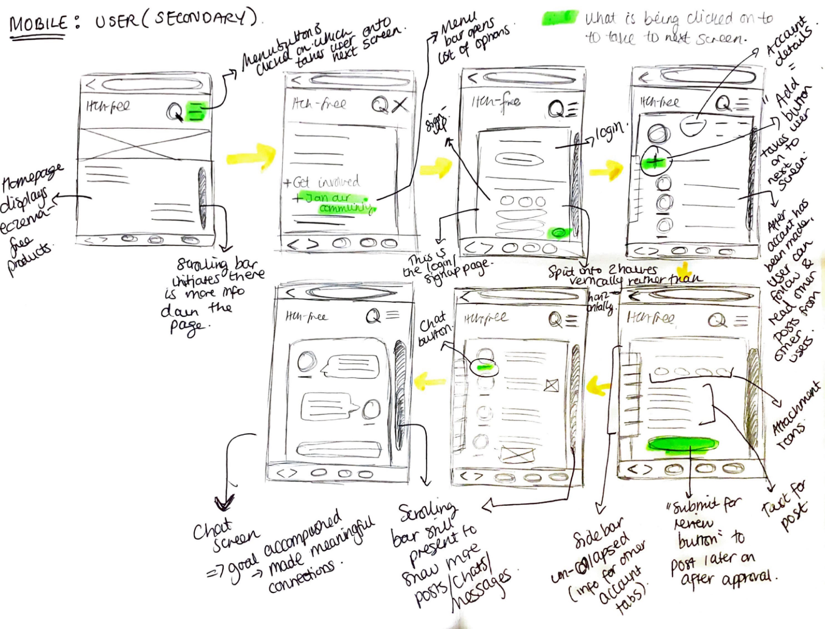
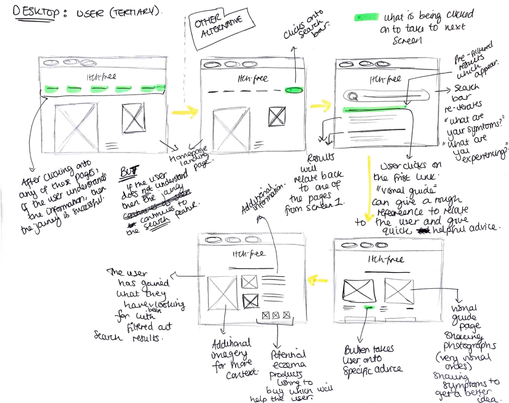
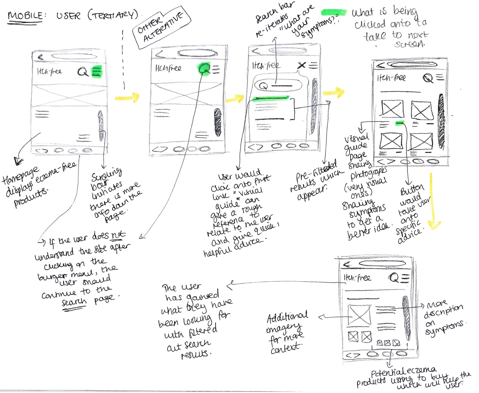
USER PERSONAS & LOW FIDELITY WIREFRAMES


The beginning stages of this process involved making sure the design would be user friendly to a wide range so establishing users and their needs at the start of the design process gave invaluable insights and areas of concern in the subject. After carrying out my user interviews, I was able to understand the pain points, needs and goals of individuals suffering and managing different conditions. The competitor analysis bought to light why these concerns existed in the first place.
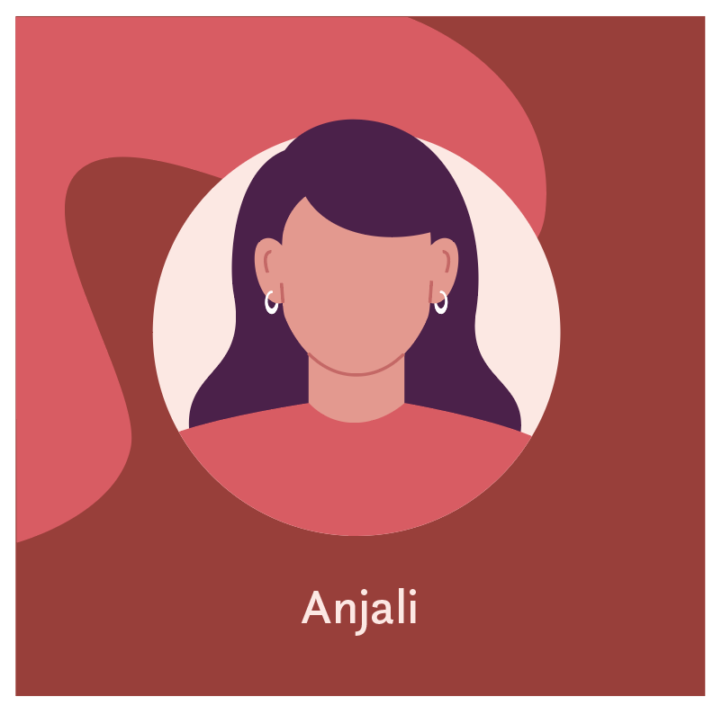
Most eczema oriented websites do not always give the user what they are looking for. For example, Anjali (primary persona), always finds it is a trial and error to find products that are appropriate to manage the skin condition. Poppy (secondary persona) struggles to find people dealing with the same thing, and Ana (tertiary persona) found that it was hard to understand the high level, medical tone of voice. The secondary and tertiary users were sourced from my peers to give a wider reach to the user spectrum. I made sure to include these concerns in the personas needs, which later helped me design the user journeys and page flows, based upon my own interview and those of my peers.
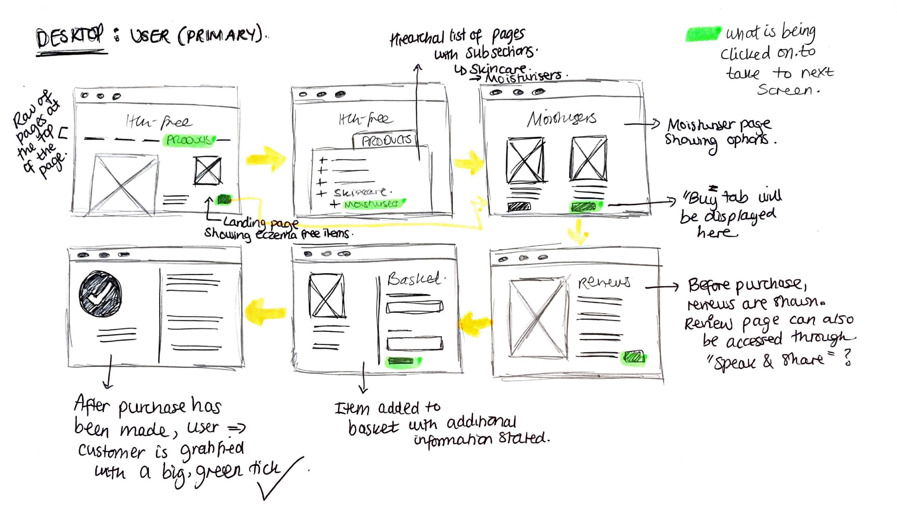
Wireframing for both mobile and desktop devices was considered as the design had to be responsive and adaptable from one screen to the next.


MID FIDELITY WIREFRAMES & USER TESTING
As there are several features this prototype, here I will take you through an example where I iterated the design after gaining valuable responses from the user testing at the given stage. This feature targets Anjali's user needs where she struggles to find appropriate items to manage her eczema.
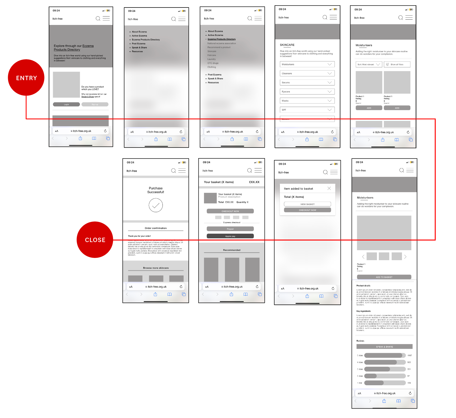
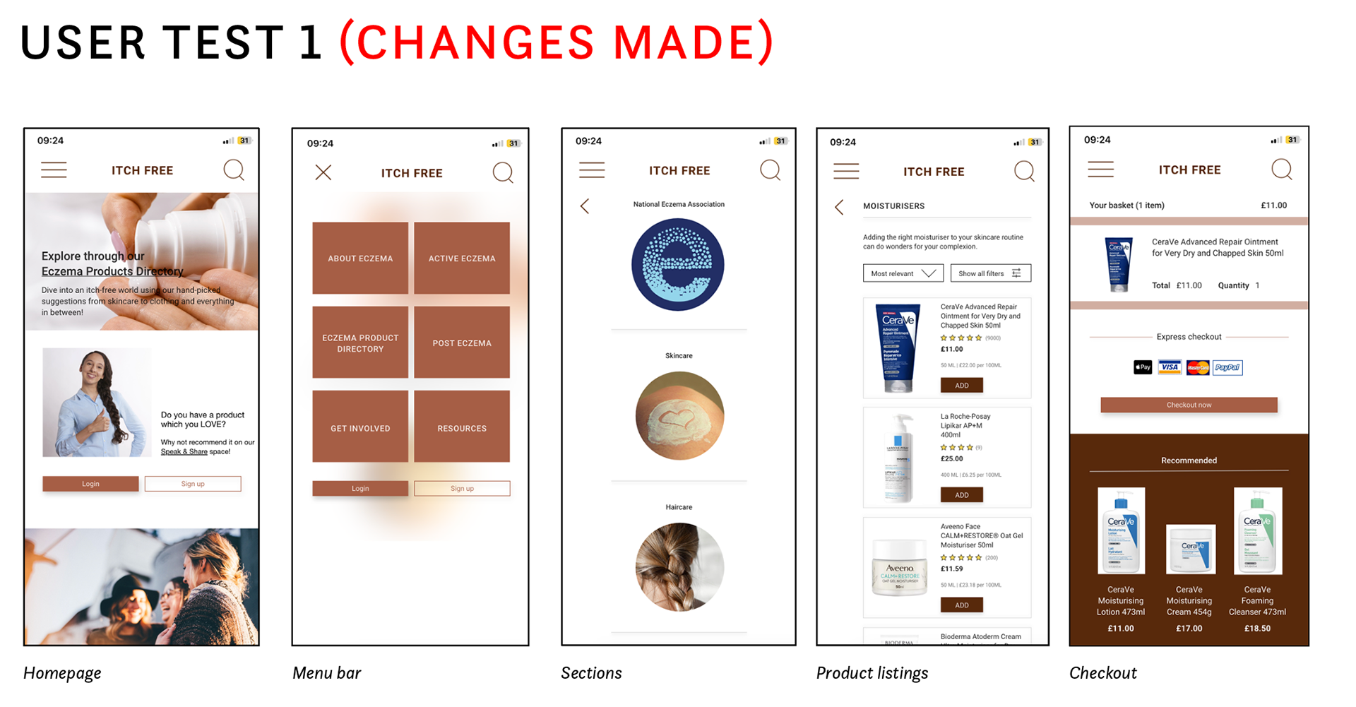
The primary goal from this user testing was to find out how usable the prototype I have designed is so far. I tested my prototype on three distinctive users to get a wider breadth of different views and opinions. Tis first user journey takes the user onto locating a product which is suited to the skin condition.
I discovered that all three users found it fairly easy to locate the item and add it to the basket before checking out. However, there were a few design and usability issues on the way. Firstly, was the lack of colour and imagery. The screenshots above show the introduction of both which have made the website 10x better already as it has added more depth and contrast into the pages.
There was another finding which was in regards to the menu bar and how it was easy to click something else due to the tight spacing of the words. It was also very text heavy when all the sections were collapsed. To remove this issue, I have put each section and labelled them in boxes shown in 'menu bar' above.
This removes the risk of clicking on a page the user does not want to go on as well as reducing the amount of text on the screen to avoid it from getting overwhelming and confusing. This section then leads onto the sub-sections which are accompanied with imagery to relate to the user and so they have a break from the text. The 'product listing' screen has also been changed in terms of the grid. Where before there would be two items on a row, now there is only one to allow enough space for the other bits of information to go in and so the user can see the item at a comfortable size before clicking onto it. Before, the checkout page displayed three buttons which made it confusing for the user as they were not sure what button would take them onto actually buying the item. I have replaced these with a single checkout now button shown above in 'checkout' to remove this confusion.
HIGH FIDELITY PROTOTYPING & FEATURES
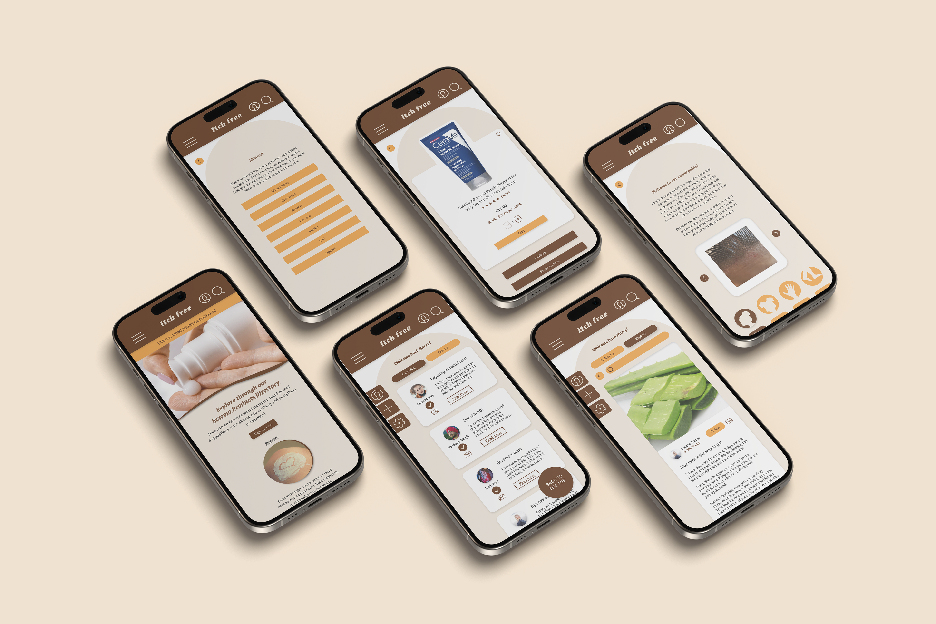
In order to design for both desktop and mobile, the design had to adapt to suit both platforms and sizes. The greatest adaptation was through the micro-typography (text and components) Due to the change in screen size across both devices, the visual hierarchy was adapted.
The overall layout has been adapted as shown in all instances with the desktop screen following a 12-column grid, whilst the mobile screen using a 6-column grid. Where there are carousels involved in the mobile screen, the desktop have the different pages listed mostly across the page due to there being more space. The imagery also acts differently where it takes up different orientations depending on what device is being designed for. The navigation bar is also adapted when it's taken from the desktop to the mobile where it stands as a burger menu rather than a list of the different pages to make it more user-friendly.
From the very first instance, Anjali's user needs are met as she is shown a thread of items and products she can browse through which will help her find something appropriate to manage her eczema. Both Anjali and Poppy's needs are met when they come across to the speak & share aspect of the homepage. Keeping this at the forefront (on the homepage) entices users like them to immediately pay attention as they would have found something that targets their pain point.
COMPONENT LIBRARY
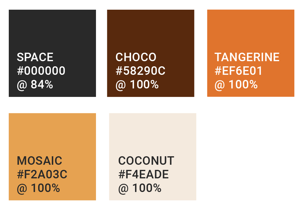
Itch Free uses Space for most of its body copy and headings. The only exception in terms for the body copy is for details which use 'Roboto Regular 6 Body Text (9pt).' Details such as the number of reviews, likes and product size details. These are designed using Choco. Tangerine is used when there is a hover state involved. Choco has been used for the top headings for example, when titles of pages are mentioned like 'Eczema product directory.' Mosaic is predominantely used for buttons when they are inactive which is paired with the text in the Choco shade. Coconut is a shade used for the background as well as being used for text and iconography when they are against Choco.
These colours have been chosen specifically as they represent different shades of skin colours; different levels of melanin people may have to represent inclusivity and diver and how eczema affects people of all colour. Tangerine and mosaic are used as an accent colour to bring life into the design.
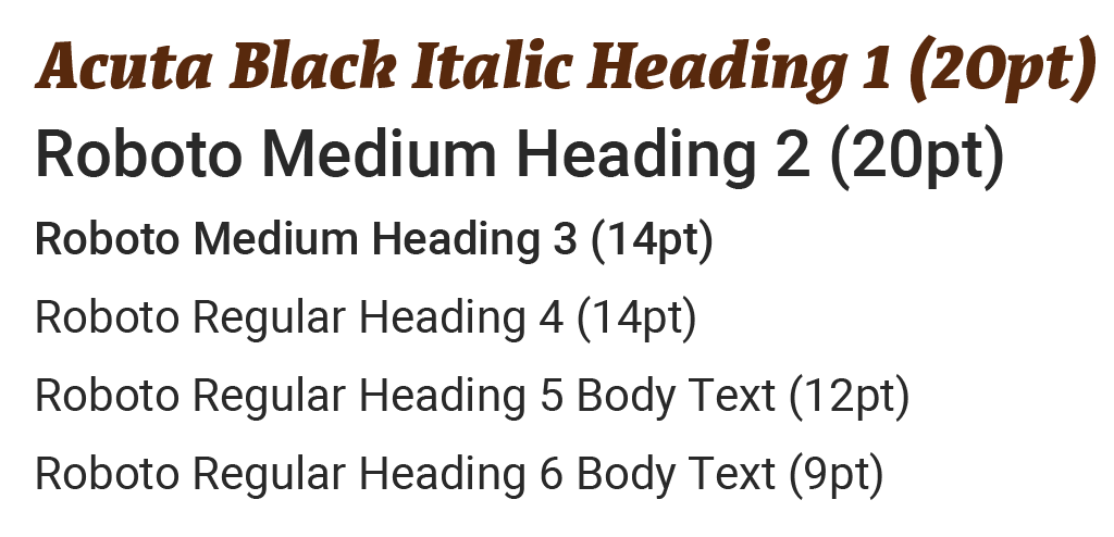
All page headings use Acuta H1. This specific typeface has been used due to its thick strokes making excellent contrast when placed on light and dark backgrounds. It also has good readability which is essential for an adaptive web design project. Roboto has been paired as it offers a wide range of variation in weights, widths and styles–making it a versatile choice for website design, specifically one which includes smaller and finer details such as
product descriptions.
product descriptions.
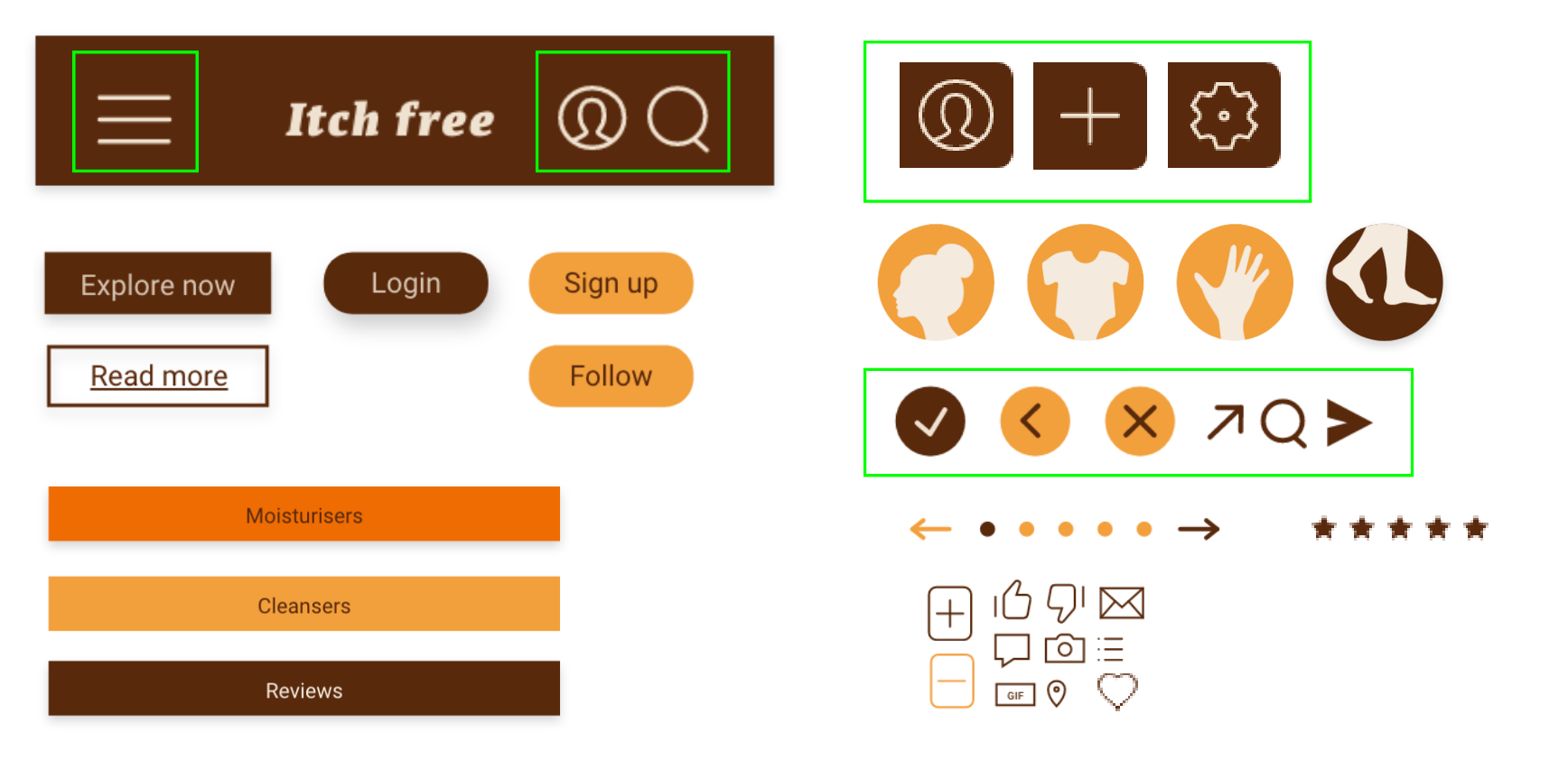
Starting with the buttons the component library involves primary buttons in 3 different shapes which use Choco as the shade of choice. Buttons with rounded corners ('login', 'signup' and 'follow') are to do with actions related to the user's personal account, whereas the short rectangular buttons are relative to continuing onto information, for example 'explore now' and 'read more.' The longer rectangular buttons are used to display names of sections like 'moisturisers', 'cleansers' and 'reviews' as displayed above. When a primary button (Choco) is chosen, a drop shadow is also present. This drop shadow also occurs when a hover state is introduced when the colour tangerine shows. For any buttons which are in an inactive state, Mosaic is used without any drop shadows.
For the icons, they most use a line width of 1 point. It is only when the icon is against a background other than white, that it needs extra help in order for it to be legible. This is why the componenets highlighted in green appear thicker. The states of the buttons use the same idea as the buttons where when they are inactive, they would use the colour Mosaic.
MOBILE PROTOTYPE WALKTHROUGH
DESKTOP PROTOTYPE WALKTHROUGH