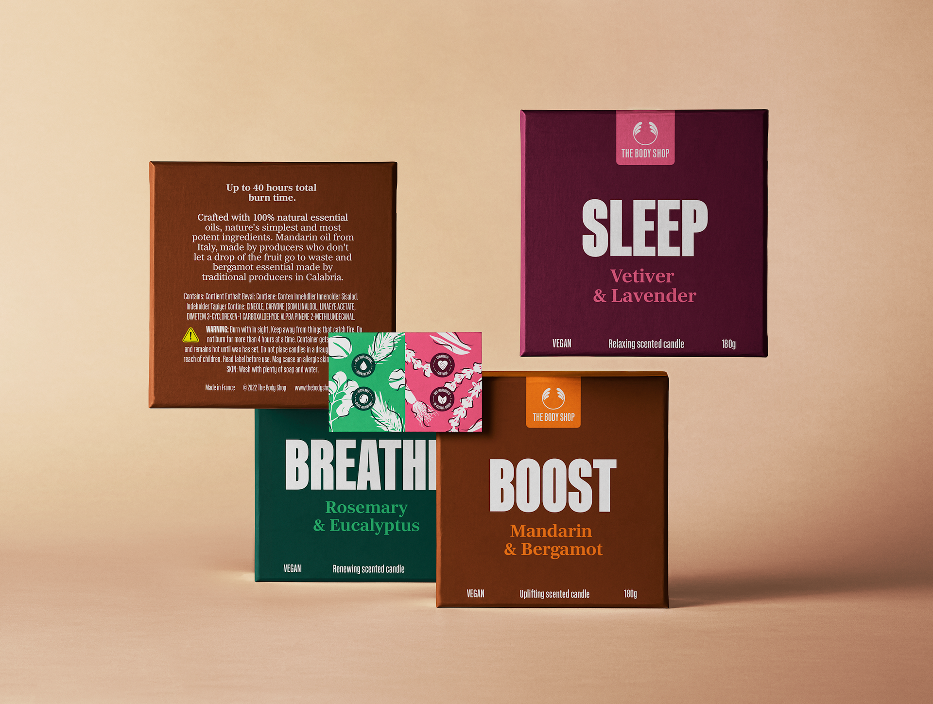
The existing Body Shop candles hold a different design identity compared to the other items in-store, in the sense it is less vibrant and eye-catching. The new iteration of the candle box packaging exhibits a lively and colourful approach. The design represents the brand’s core values of being natural, bold and sustainable.
There are three different scents in the range. The illustrations developed during the design process alongside the colour choices reflect the natural ingredients used in the essence of the candles. The absence of detail inside the illustrations also supports this idea. The boldness is also reflected by the colour choice, but by the typographic choices made too. Large typography is used inside the shop where it makes a statement, but less on the actual packaging so I thought it was a good chance to bring this synergy into the packaging of the candles to initiate a real brand presence.
As the company is also going under administration, it is likely these products would be sold elsewhere without physical testers alongside the packaged boxes like the brand does at the moment. The die-cut line (hole at the top) comes in handy as The Body Shop customers are familiar with testing out the products sold before buying and continuing this culture, even when the items are placed in a different environment outside of their own store is vital to withstand the companies morals, reputation and ideals.