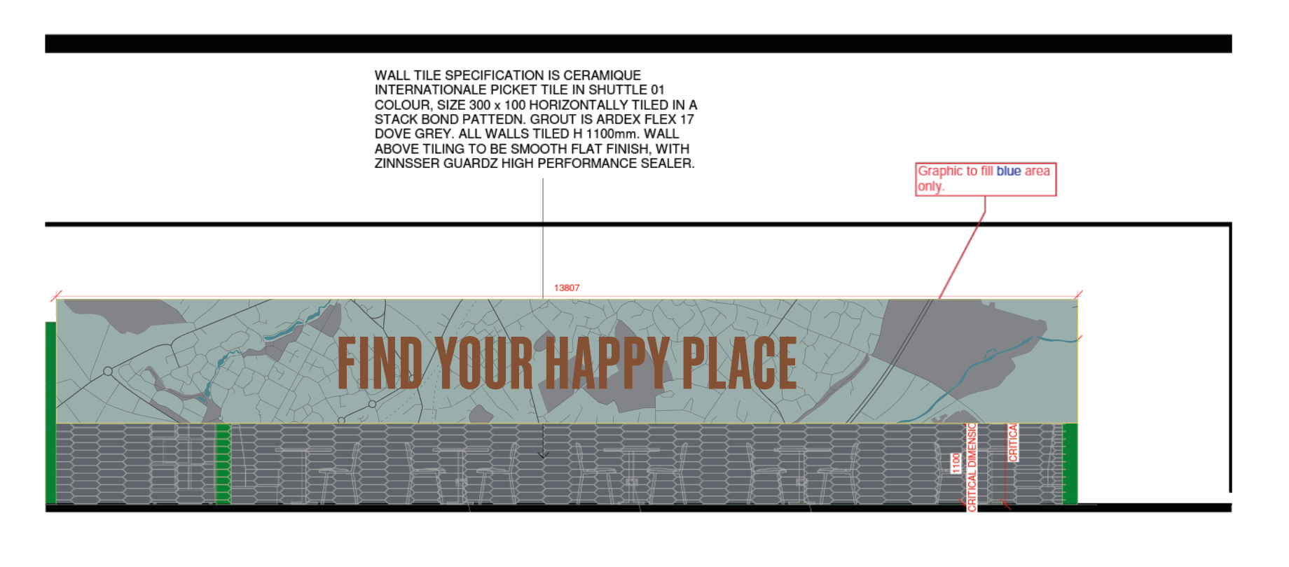
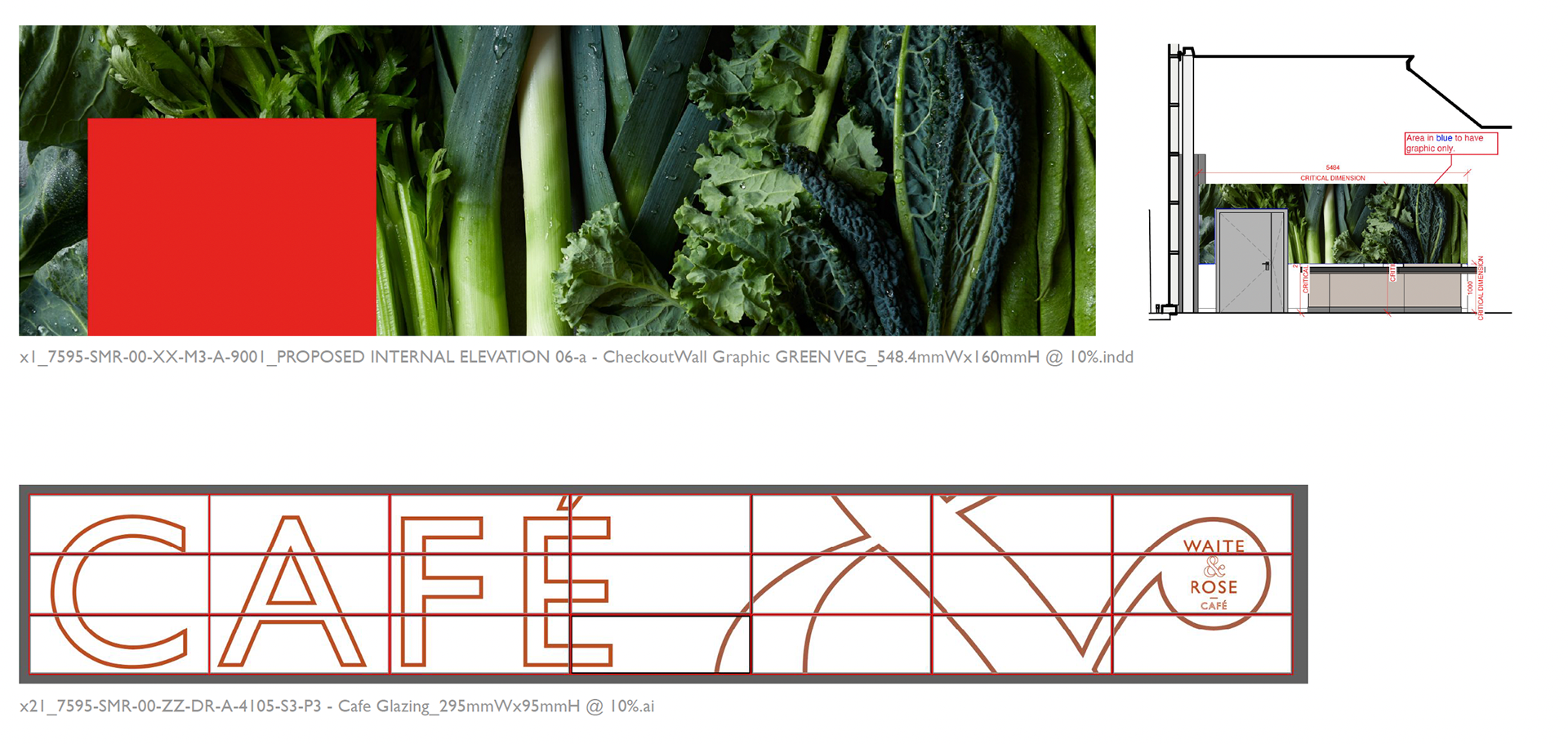
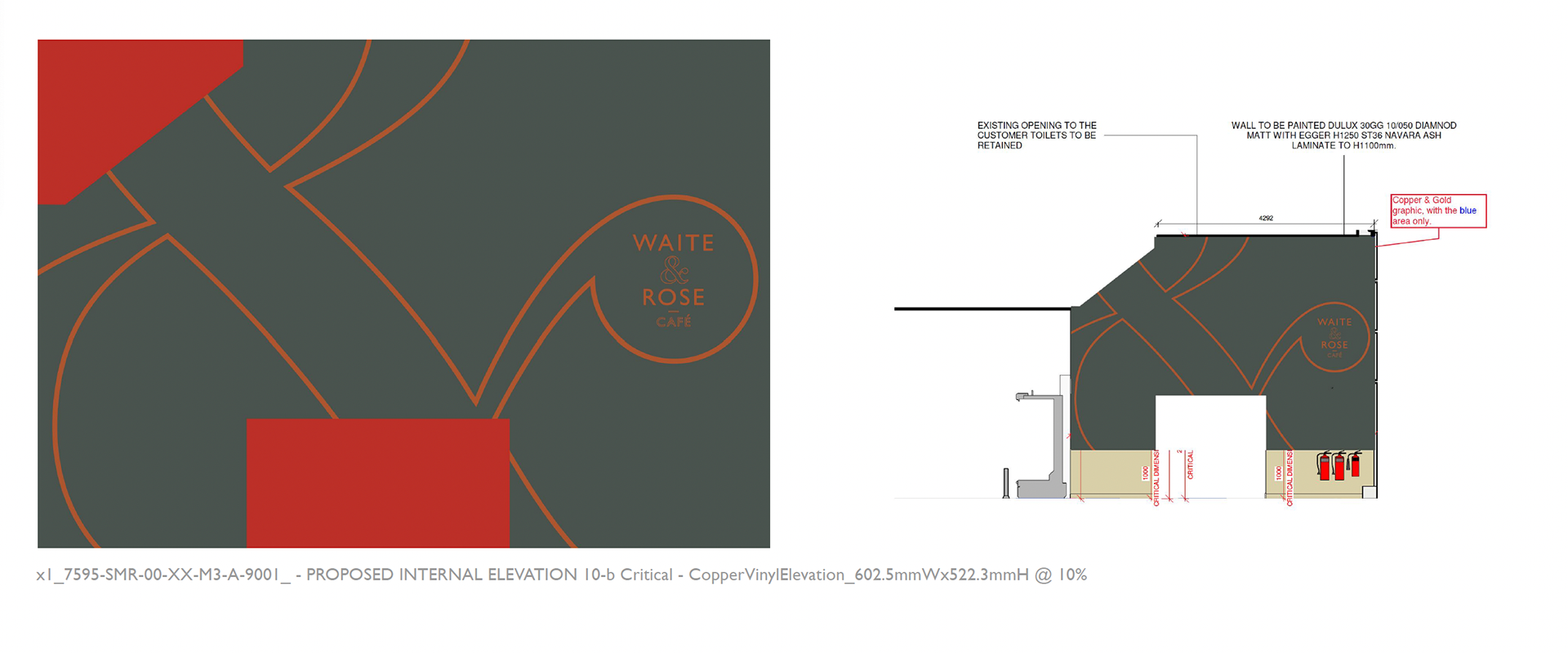
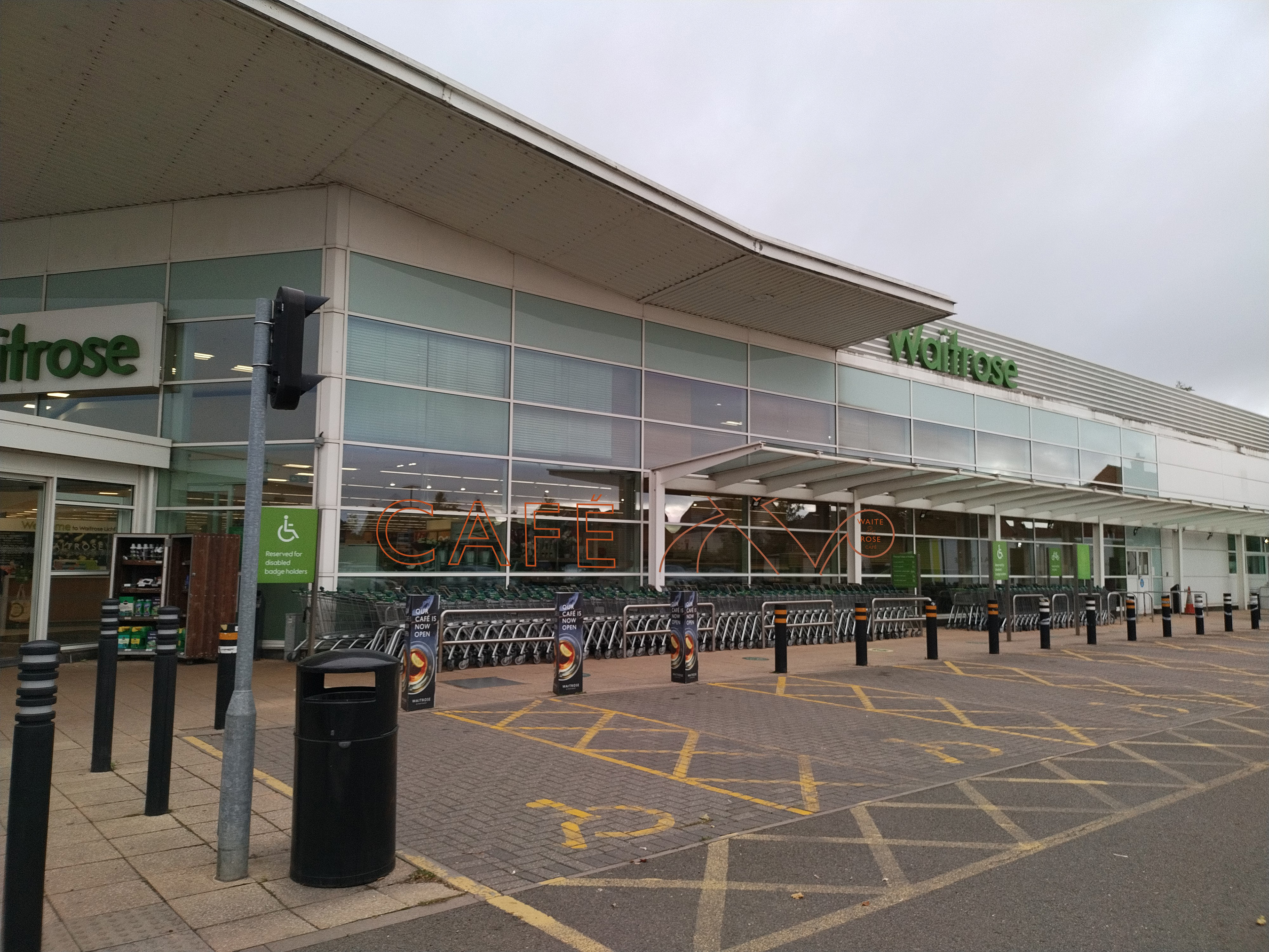
The Store Development brief for Lichfield has allowed me to explore another area in design; specifically designing for walls and windows. Due to the Waitrose store in Lichfield undergoing refurbishments, I had the opportunity to design and artwork the design for a new checkout wall graphic, a new 'Find your happy place' graphic, a secondary wall which used the Waite & Rose ampersand illustration and lastly using a similar illustration for the windows in the store. As part of the brief, I had the chance to work with an illustrator who worked on the map graphic for one of outcomes. I briefed the illustrator about what this graphic should entail; a detailed illustration of a map showing Waitrose Lichfield and any surroundings (including a variety of details such as different types of roads, greenery and rivers) This graphic was for the windows on the outside as a nice welcome for customers coming into store and also making it the store more own-able to Lichfield itself.
I have learned how helpful and crucial it is to extract relevant information from the different spreadsheets and PDFs given and putting it into a deck so that it is visually clear on what has to be done. Doing this also helps to see any mistakes (e.g. dimensions) and whether we have all the necessary information or not to successfully complete the brief.
As designing for windows and walls can result in large files, I designed at 10%. It was also important to ensure all elements which were on different vinyls were designed on different layers to make it easier when the files were taken to production and to avoid any confusion.
When designing for cafe walls and windows, it was important to consider what surrounds the wall already and to not work on the design in isolation. Repeating imagery on walls which are in close proximity is not ideal, therefore carefully identifying where the wall sat was crucial.