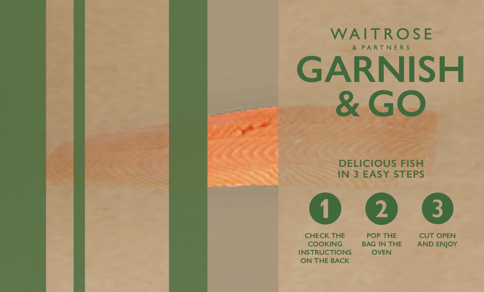
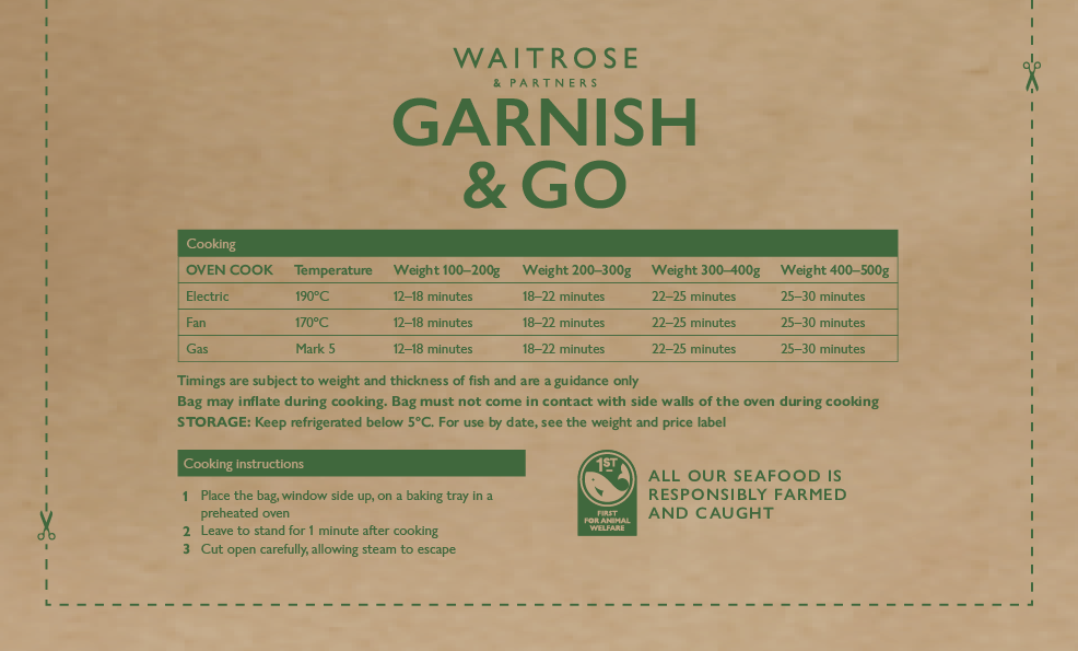
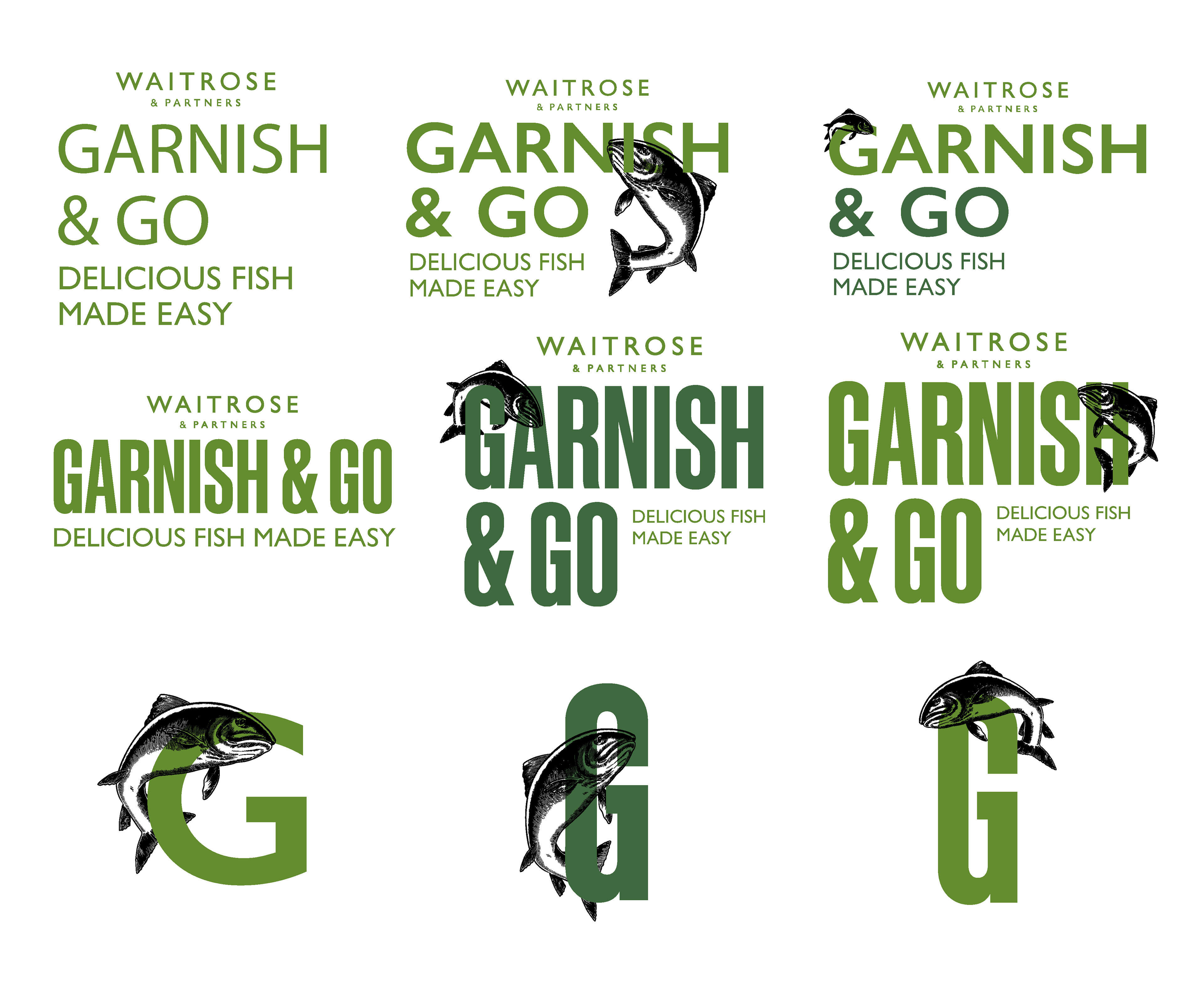
For the redesign of the Garnish & Go fish bags, it was important to represent the Waitrose brand whilst also being clear with the information on the front and reverse. I had the opportunity to experiment with the overall lock-up, using their guest typeface as well adding an illustration into the mix. I enjoyed coming up with the different ways to showcase the logo for Garnish & Go. As these bags are free of charge, there was a limit on the print coverage.
We decided to go forward using the Gill as this printed item is used for in-house purposes, therefore it felt right to follow the original brand guidelines.